


What is Bootstrap and Why you should use it in Web Development
In the world of web development, What is Bootstrap? is a very common question. You may have searched for an answer but come away without a clear one. That’s why I’ve written this article: to give you a simple, straightforward explanation.
What is Bootstrap
Bootstrap is the most popular free, open-source framework for building responsive web layouts with minimal effort. It provides ready-made HTML, CSS, and JavaScript components for forms, buttons, navigation bars, dropdowns, modals, grids, and much more. With Bootstrap, you can build all of these quickly, without writing the large amount of custom code they would normally require. If you are a web developer then Bootstrap is for you.
Before Bootstrap, web designers had to write CSS Media Queries by hand to make a site responsive. Bootstrap simplified this by handling media queries for you, removing the complexity and making the process fast and easy.
Please check the article on CSS Media Queries to get more information on this topic.
Bootstrap’s first version was released on August 19, 2011, by a team of developers at Twitter. Its main goal was to bring consistency to web development projects. Before then, teams relied on a variety of different libraries, which led to inconsistency, higher maintenance costs, and extra burden.
Bootstrap solved that inconsistency problem and became an instant hit. Today millions of websites are using it.
Bootstrap can be downloaded from here.
Bootstrap Advantages
Web designers and developers love to use Bootstrap in their projects. They use it to create a responsive web design that looks perfectly accurate on all screen sizes (smartphones, tablets, laptops and PCs).
Web developers should consider the following advantages of Bootstrap:
- Efficiency: Predefined classes and design templates accelerate feature development.
- Responsive design: Pages adapt automatically to all screen sizes, eliminating the need for manual media queries.
- Browser compatibility: Bootstrap supports the latest versions of all major browsers, including Chrome, Firefox, Opera, Safari, and Edge.
- Ease of use: A basic understanding of HTML and CSS is sufficient to get started.
- Consistency: It promotes uniformity across projects and among development teams.
- Free and open source: Bootstrap carries no usage restrictions and is hosted on GitHub, where developers can contribute to its development.
Bootstrap Structure
Talking about the structure of Bootstrap – It is made up of 2 main parts. These are:
- bootstrap.css – It contains the global settings, fundamental HTML elements styled with classes, and an advanced grid system. After downloading bootstrap go inside the css where you will find this file. There are two versions of this file bootstrap.css and bootstrap.min.css (minified version) and can use any one of these. Add a reference to this file in the page head area of your web page and before the reference of other stylesheets of your website.
- bootstrap.bundle.js – It contains the JavaScript framework of bootstrap. Find it inside the js folder. Add a reference to it just before the <body/> tag in your webpage.
How to Use Bootstrap 5 in Website
In order to use bootstrap you have to add ‘bootstrap.css’ and ‘bootstrap bundle js’ in your website. The below image illustrates this.
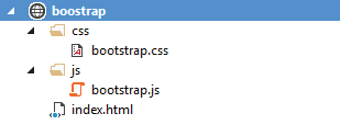
STEP 1 : Start by adding a new index.html file to your project root. Don’t forget the <meta name="viewport"> tag, which makes your page respond properly on mobile devices.
<!doctype html>
<html lang="en">
  <head>
    <meta charset="utf-8">
    <meta name="viewport" content="width=device-width, initial-scale=1">
    <title>Bootstrap Demo</title>
  </head>
  <body>
    <h1>Hello, Bootstrap!</h1>
  </body>
</html>
STEP 2 : Include Bootstrap’s CSS and JavaScript in your page. Add the <link> tag for the CSS inside the <head>, and place the <script> tag for the JavaScript bundle (which includes Popper for positioning dropdowns, popovers, and tooltips) just before the closing </body> tag.
<!doctype html>
<html lang="en">
  <head>
    <meta charset="utf-8">
    <meta name="viewport" content="width=device-width, initial-scale=1">
    <title>Bootstrap Demo</title>

    <!-- Bootstrap core CSS -->
    <link href="css/bootstrap.css" rel="stylesheet">

  </head>
  <body>
    <h1>Hello, Bootstrap!</h1>

    <!--Reference to Bootstrap core JavaScript-->
    <script src="js/bootstrap.bundle.js"></script>

  </body>
</html>
That’s all, now you are ready to use Bootstrap in your website. Open the page in whatever browser you like and check out your Bootstrapped page. From here, you can start building by putting together your own layout and dropping in dozens of Bootstrap Components.
We can also reference Bootstrap CSS and JS files from Bootstrap CDN. See be code below.
<!doctype html>
<html lang="en">
  <head>
    <meta charset="utf-8">
    <meta name="viewport" content="width=device-width, initial-scale=1">
    <title>Bootstrap Demo</title>
    <link href="https://cdn.jsdelivr.net/npm/bootstrap@5.3.8/dist/css/bootstrap.min.css" rel="stylesheet" integrity="sha384-sRIl4kxILFvY47J16cr9ZwB07vP4J8+LH7qKQnuqkuIAvNWLzeN8tE5YBujZqJLB" crossorigin="anonymous">
  </head>
  <body>
    <h1>Hello, Bootstrap!</h1>
    <script src="https://cdn.jsdelivr.net/npm/bootstrap@5.3.8/dist/js/bootstrap.bundle.min.js" integrity="sha384-FKyoEForCGlyvwx9Hj09JcYn3nv7wiPVlz7YYwJrWVcXK/BmnVDxM+D2scQbITxI" crossorigin="anonymous"></script>
  </body>
</html>
☺ Want to start using Bootstrap in your website right away? Check the following tutorials:
- How to Use Bootstrap to Create Responsive Design
- How to Use Bootstrap to Make Images, Videos and Navbar Responsive
Why You Should Use Bootstrap?
If you build websites or web projects, Bootstrap is well worth using. The main reason is that it gives your site the responsiveness it needs most.
- Better search visibility: Search engines now treat responsive, mobile-friendly design as a top priority. Google uses mobile-first indexing, so a site that doesn’t work well on phones can struggle to rank.
- No more media queries: Writing media queries by hand is lengthy and time-consuming. Bootstrap handles them for you, saving a lot of hard work.
- Constantly improving: Bootstrap is open source, and millions of developers contribute new features and fixes over time. This includes support for new browser versions and entirely new browsers. When a new version is released, you just update your Bootstrap files and it takes care of the rest.
- Faster development: Ready-made components such as navbars, forms, buttons, modals, and cards let you build pages in a fraction of the time it takes to code them from scratch.
- Mobile-first approach: Bootstrap is designed for small screens first and scales up to larger ones, which matches how most people browse today.
- Consistent design: Every component follows the same visual style, so your pages look uniform and professional across the whole project.
- Cross-browser compatibility: Bootstrap works reliably in all major modern browsers, so you spend less time debugging browser-specific issues.
- Powerful grid system: The flexible 12-column grid makes it simple to build layouts that rearrange themselves across screen sizes.
- Easy customization: You can override styles with your own CSS or customize Bootstrap through Sass variables, so your site doesn’t have to look like every other Bootstrap site.
- Great documentation and community: Clear documentation, plenty of tutorials, and a huge community mean answers are easy to find when you get stuck.
- Beginner-friendly: If you know basic HTML and CSS, you can start building with Bootstrap right away.
- Free to use: Bootstrap is open source and free for personal and commercial projects.
Conclusion
By this time you may have got your answer of What is Bootstrap. Hopefully you learned about Bootstrap and its tremendous positives in web projects. This tutorial only tells a little of what this framework is capable of but I am confident that you will take it from here. A quick Google search on different bootstrap topics will point you in the right direction.
SHARE THIS ARTICLE


Related Tutorials:



ABOUT THE AUTHOR
I hope you enjoyed reading this tutorial. If it helped you then consider buying a cup of coffee for me. This will help me in writing more such good tutorials for the readers. Thank you.
Please Consider Donating us
We are helping millions of Beginners and Professionals to learn new programming technologies.
Please consider donating us:



HELLO EVERYONE
 Welcome to YogiHosting - A Programming Tutorial Website. It is used by millions of people around the world to learn and explore about ASP.NET Core, Blazor, jQuery, JavaScript, Docker, Kubernetes and other topics.
SUBSCRIBE TO NEWSLETTER
Enter your email address to subscribe to this blog and receive notifications of new posts by email.
Join 90K other subscribers