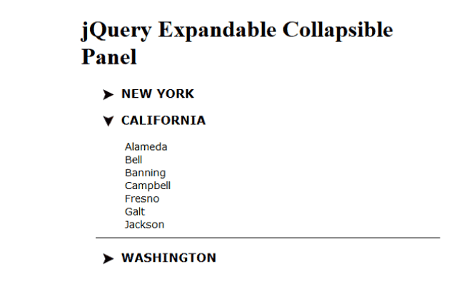
Creating jQuery Expand Collapse Panels In HTML with “minimum” codes

The jQuery Expand Collapse Panels are used for breaking content rich pages into separate sections. So they allow visitors to navigate easily to a particular section based on his choice. There is an arrow, which on clicking, reveals the content of the section. Developers always have the need to include these Expand Collapse Panels in their websites, and therefore they will find this tutorial useful.
In this tutorial I will explain how to create a simple & powerful jQuery Expand Collapse Panels. Here I use just a few lines of jQuery code with little CSS.
I will create 3 expandable panels for 3 states of United States of America. When a user clicks the arrow, which is given in front of them, the corresponding state panel will expand and reveals the cities of the state.
On clicking the arrow again the panel will collapse.
<div class="mainDiv">
    <div class="expandableCollapsibleDiv">
        <img src="Image/up-arrow.jpg" />
        <h3><a>NEW YORK</a></h3>
        <ul>
            <li><a>Albany</a></li>
            <li><a>Buffalo</a></li>
            <li><a>Kingston</a></li>
            <li><a>Tonawanda</a></li>
            <li><a>Sherrill</a></li>
            <li><a>Sherrill</a></li>
            <li><a>Oneida</a></li>
        </ul>
    </div>
    <div class="expandableCollapsibleDiv">
        <img src="Image/up-arrow.jpg" />
        <h3><a>CALIFORNIA</a></h3>
        <ul>
            <li><a>Alameda</a></li>
            <li><a>Bell</a></li>
            <li><a>Banning</a></li>
            <li><a>Campbell</a></li>
            <li><a>Fresno</a></li>
            <li><a>Galt</a></li>
            <li><a>Jackson</a></li>
        </ul>
    </div>
    <div class="expandableCollapsibleDiv">
        <img src="Image/up-arrow.jpg" />
        <h3><a>WASHINGTON</a></h3>
        <ul>
            <li><a>Asotin</a></li>
            <li><a>Bellingham</a></li>
            <li><a>Bothell</a></li>
            <li><a>Camas</a></li>
            <li><a>Clarkston</a></li>
            <li><a>Cheney</a></li>
            <li><a>Newport</a></li>
        </ul>
    </div>
</div>
Inside the main div, I have created 3 Expand-Collapsible divs. I have given them the class called expandableCollapsibleDiv. The name of the state is placed in the h3 tag while an arrow (which is an image) is shown just in front of it.
When the arrow is clicked then it will open or close the city panels. I have made the city panels (which acts as Expand Collapse panels) in a ul tag.
body {
    margin: 0 auto;
    width: 500px;
}

.mainDiv {
    font-family: Verdana;
    font-size: 14px;
    padding-left: 20px;
    padding-right: 5px;
}

.expandableCollapsibleDiv img {
    cursor: pointer;
    margin-right: 10px;
    margin-top: 5px;
    padding-left: 10px;
    float: left;
}

.expandableCollapsibleDiv ul {
    border-bottom: 1px solid #000;
    clear: both;
    list-style: outside none none;
    margin: 0;
    padding-bottom: 10px;
    display: none;
}
Just a few lines of CSS to provide proper styling to this Expand & Collapse Panels.
<script type="text/javascript" src="JS/jquery.min.js"></script>

<script type="text/javascript">
  $(document).ready(function () {
    $(".expandableCollapsibleDiv > img").click(function (e) {
      var showElementDescription =
        $(this).parents(".expandableCollapsibleDiv").find("ul");

      if ($(showElementDescription).is(":visible")) {
        showElementDescription.hide("fast", "swing");
        $(this).attr("src", "Image/up-arrow.jpg");
      } else {
        showElementDescription.show("fast", "swing");
        $(this).attr("src", "Image/down-arrow.jpg");
      }
    });
  });
</script>
I have used the jQuery Selector to select the up-arrow and down-arrows like:
$(".expandableCollapsibleDiv > img")
How jQuery “Collapse” Panel Works
The jQuery code makes this Expand Collapse Panels to working mode. Here I have created a click event of the img tag. You can see that this ‘img’ tag is placed inside the ‘div’ element having CSS called expandableCollapsibleDiv.
In the click event, the code checks if the ul element of the expandableCollapsibleDiv is Expanded i.e. visible or not.
If it is visible then I hide it (i.e. Collapse it) and up-arrow is shown.
How jQuery “Expand” Panel Works
In the same way if the ul element of the expandableCollapsibleDiv is Collapsed i.e. hidden, then it is changed to Expanded i.e. show, and the arrow is changed to the down one.
In this way you can create jQuery Expand Collapse Panels very easily and use them in our web pages.
Check the below link:


 Welcome to YogiHosting - A Programming Tutorial Website. It is used by millions of people around the world to learn and explore about ASP.NET Core, Blazor, jQuery, JavaScript, Docker, Kubernetes and other topics.