


How to create Responsive Web Design using CSS Media Queries
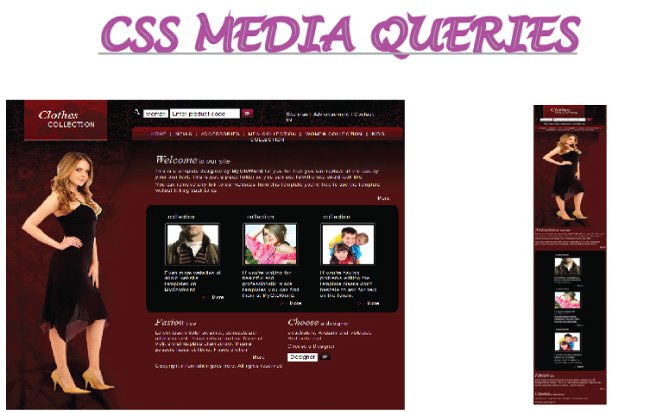
More and more people now browse the internet on their smartphones, so it is essential that your website works well on small screens too. The technical term for this is Responsive Web Design: a site whose layout adapts to the size of the device it is viewed on. A responsive website improves user engagement across all kinds of devices and lowers the bounce rate. It also brings SEO benefits, since search engines like Google favor mobile-friendly sites.
What is Responsive Web Design
By Responsive Web Design, I mean a website that fits well on all screen sizes, including phones, tablets, and computer screens. A responsive website does not require horizontal scrolling, and users do not need to zoom in to read the content.
This type of design brings optimal viewing and interactive experience to site visitors. It makes the contents of the website easy for reading and provides better navigation.
CSS Media Queries are used to make Responsive Web Design and you are going to learn everything in this tutorial.
Applying CSS Media Queries
- Step 1: Add the viewport meta tag. Place the viewport meta tag inside the <head/> section of your page:
<meta name="viewport" content="width=device-width, initial-scale=1">By this I mean that if their screen size is 320 pixels then the browser will remain 320 pixels wide for the page. Similarly if the screen size is 480 pixels then the browser will remain 480 pixels in width.
No Viewport Tag
Without the viewport meta tag, a mobile browser renders the page at a wider virtual width (often around 980px) and then scales it down to fit the screen. The whole page is visible, but the text and other elements appear very small.
- Step 2: Add media queries to your CSS file. A media query uses the @media rule to apply CSS only when a condition is true, such as the screen being wider or narrower than a certain size. Use min-width and max-width in the condition to target a range of screen sizes.
For example if you want to apply styles only for screen size from 320px to 480px our CSS will look like –
body {
    width: 960px;
}

//other styles
@media only screen and (min-width : 320px) and (max-width : 480px) {
    body {
        width: 320px;
    }

//other css classes for the screen size
}
If you note the above lines, I have made the body width as 960 px for all screen size but for the smaller screen size starting from width from 320 px to 480 px I have made the body width 320px.
In this way you can target many different screen sizes, like that of tablets, smartphones or larger screens too.
Common Screen Sizes to Target
For making a Responsive Web Design you should target screens of all sizes so that whatever device a person is using the website should open well in that.
Thus if your website is made for a screen size of 960 pixels then our responsive CSS will look like –
body {
    width: 960px;
}

// other styles classes for the screen size
@media only screen and (min-width : 320px) and (max-width : 480px) {
    body {
        width: 320px;
    }

//other styles for the screen size 320px to 480px
}

@media only screen and (min-width : 481px) and (max-width : 540px) {
    body {
        width: 481px;
    }

//other styles for the screen size 481px to 540px
}

@media only screen and (min-width : 541px) and (max-width : 767px) {
    body {
        width: 541px;
}

//other styles for the screen size 541px to 767px
}

@media only screen and (min-width : 768px) and (max-width : 959px) {
    body {
        width: 541px;
    }

//other styles for the screen size 768px to 959px
}
Common Tools for Testing Responsive Web Design of Website
- Chrome Developer Tools is very good to test responsive nature of your site. To open it press the F12 key then press Ctrl + Shift + M Keys.
- Firebug which is an Add-on for Mozilla provides a very good tool for testing whether a web design is responsive or not. It also helps to test how your designed web page will look on different screen sizes. To use it go to Tools > Web Developer > Responsive Design View. You can also open it by holding Ctrl + Shift + M Key.
- Alternately you can resize of your browser to test the responsive nature.
A Working Example of a Responsive Web Design
Media Only Screen
In our CSS Media Queries you have to use Media Only Screen property. Though this you can place conditions on Screen Width in the CSS and this force the website to adapt to various of screen dimensions.
Media Only Screen is very important, do see carefully how I have applied it in our CSS Media Queries.
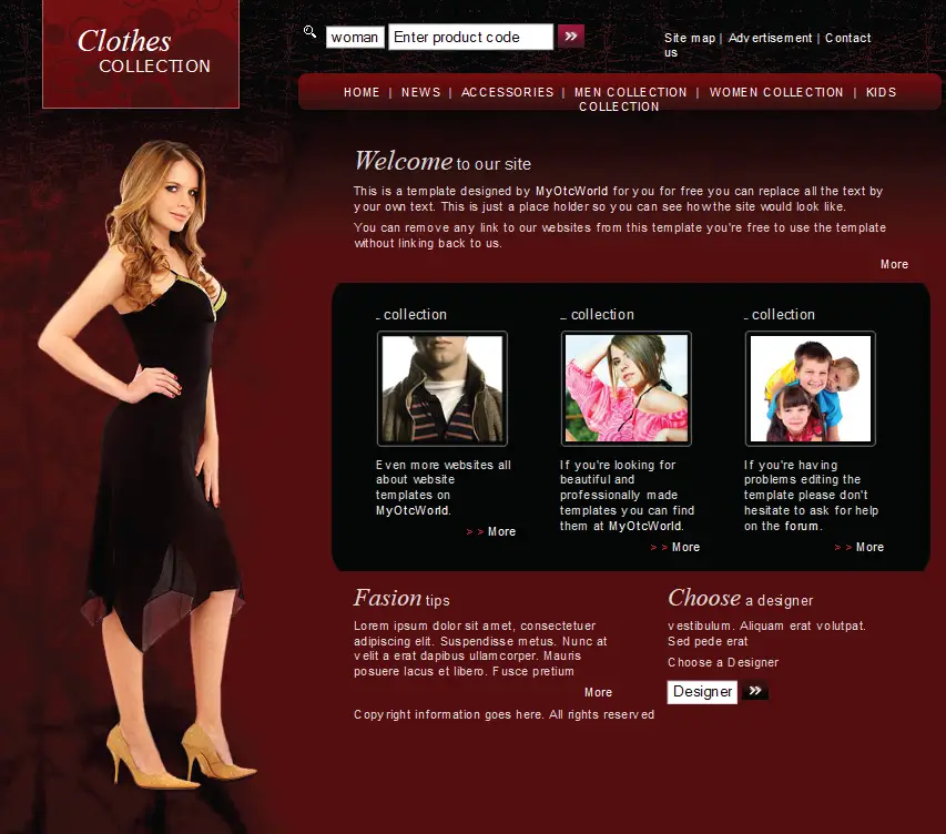
Let’s make a web page responsive by using CSS Media Queries.
1. First add viewport meta tag on the page head section:
<meta name="viewport" content="width=device-width, initial-scale=1" />
@media only screen and (min-width : 320px) and (max-width : 480px) {
    #wrapper {
        width: 310px;
        overflow: hidden;
    }

    #uppers {
        left: 0px;
        margin-top: 75px;
    }

    #nav-top {
        left: 40px;
        margin-top: 30px;
    }

    #left-person {
        top: 200px;
    }

    #nav {
        width: 310px;
        left: 0px;
        margin-top: 90px;
    }

    #body {
        width: 310px;
        margin-left: 0px;
        padding-top: 845px;
    }

    #black-tl {
        margin-left: 0px;
        width: 310px;
    }

    .black-box {
        margin-left: 65px;
    }

    #footer {
        margin-left: 0px;
        width: 310px;
    }

    #tips {
        width: 310px;
    }

    #choose {
        width: 310px;
        margin-left: 0px;
    }
}
Explanation

a. If you see the media queries above, you will find that I have made the width of wrapper div 310 pixels (a little smaller than the minimum screen size) and used overflow: hidden.
It is the base width of our website for screen size from 320px to 480px.
b. Then I brought the uppers div below the logo on the left. I have provided it with CSS properties left: 0px; margin-top: 75px;. In the same way I brought nav-top div on the left below uppers div.
c. The left-person div is brought slightly lower. This is done to prevent its view from hiding. This div contains the picture of the model.
d. I brought nav div which contains the main menu on the left and made its width 310px from 500px.
e. The div body is brought to the left below the model image and its width is set to the base width of 310px.
f. The 3 clothes images which are inside the black area were earlier in the same line. On the smaller view of 320px to 480px I cannot show them in a single line therefore I have shown them one below the other.
To do this I have brought black-tl div on the left and set its width to the base size of 310px. Due to this the inner 3 div which have property float: left; will automatically come down one below the other.
g. At the last I have set the footer div with to 310px and the two inner divs Fashion Tips and Choose a Designer one below the other.
In the same way I can add more conditional statements for other screen sizes which are bigger than 480px, like 481px to 540px and so on, till the webpage becomes responsive for all screen sizes.
Screen sizes of popular devices
Provide screen sizes of popular devices which you can add to the conditional statements of your media queries.
a. iPhone 4 and 4S in portrait and landscape view
@media only screen
and (min-width : 320px)
and (max-width : 480px) { /* Put Styles Here */}
b. iPhone 4 and 4S in portrait orientation
@media only screen
and (min-width : 320px)
and (max-width : 480px)
and (orientation : portrait)
{ /* Put Styles Here */}
c. iPhone 4 and 4S in landscape orientation
@media only screen
and (min-width : 320px)
and (max-width : 480px)
and (orientation : landscape)
{ /* Put Styles Here */}
d. iPhone 5 and 5S
@media only screen
and (min-width : 320px)
and (max-width : 568px)
{ /* Put Styles Here */}
e. iPhone 6, 6S, 7 and 8
@media only screen
and (min-width : 375px)
and (max-width : 667px)
{ /* Put Styles Here */}
f. iPhone 17
@media only screen
  and (min-width: 400px)
  and (max-width: 440px) {
  /* Put styles here */
}
g. All iPads
@media only screen
and (min-width : 768px)
and (max-width : 1024px)
{ /* Put Styles Here */}
Download the source codes:
Conclusion
Hope you like this CSS Media Queries Tutorial. I would also like to tell you that applying these Queries can be time consuming job. There are also easy alternative like Bootstrap for making any web page responsive.
SHARE THIS ARTICLE


Related Tutorials:




ABOUT THE AUTHOR
I hope you enjoyed reading this tutorial. If it helped you then consider buying a cup of coffee for me. This will help me in writing more such good tutorials for the readers. Thank you.
Please Consider Donating us
We are helping millions of Beginners and Professionals to learn new programming technologies.
Please consider donating us:




HELLO EVERYONE
 Welcome to YogiHosting - A Programming Tutorial Website. It is used by millions of people around the world to learn and explore about ASP.NET Core, Blazor, jQuery, JavaScript, Docker, Kubernetes and other topics.
SUBSCRIBE TO NEWSLETTER
Enter your email address to subscribe to this blog and receive notifications of new posts by email.
Join 90K other subscribers